

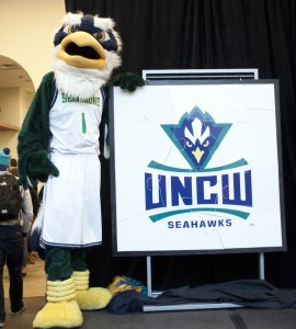
 After a yearlong process of meetings and revisions, the University of North Carolina Wilmington unveiled its new athletic logo Wednesday night before a crowd of students in Wagoner Hall.
The Seahawk logo has now been redesigned six times over the years. The logo used prior to the unveiling, a wave incorporated into the Seahawk in profile, was created by local artist Gary Longordo in 1992.
“[It] was a great piece of art, it said a lot about where we are…with the wave,” senior associate athletic director Rob Aycock said. “But we wanted to really move in the direction of having a fierce athletic logo.”
The university entrusted Pennsylvania-based design agency Joe Bosack and Company with the task of creating the new identity. The firm has extensive experience designing athletic logos, Aycock said, including the NCAA championship logos.
The design process took about a year, he added.
“We’ve had multiple focus groups, we’ve had numerous revisions and we’ve gone down the path of a couple different things,” he said, “but once we got in this sort of vein it really came together pretty quickly at the end and we were just refining small details.”
The new logo depicts the Seahawk from the front rather than the side, with the hawk’s beak forming a triangle pointing to the UNCW logotype. Aycock said the slanted yellow eyes are what really give the mark a dynamic presence.
UNCW junior Reagan Barnes agreed.
“It looks like he’s saying, ‘don’t mess with us,’” she said, snapping her fingers for emphasis.


